
Manifest California
NAMING, IDENTITY, BUSINESS CARD DESIGN
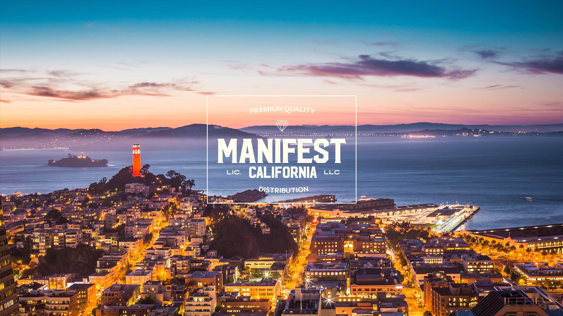
The Gill Family had been in the liquor and grocery distribution business for more than 30 years when they decided to make the leap to marijuana. With the shift from liquor to cannabis, the family business was due for a branding overhaul. Enter The Grass Agency. We wanted to create a brand that spoke to the family’s long history of logistics and shipping know-how. It would need to be versatile enough to expand beyond distribution and create a sense of history, quality, transparency, and discovery. We started with the name: Manifest. In distribution, manifest describes a document that details a ship’s contents. It can also be used as an adjective to describe something that is clear or apparent. As a verb it means “to display or show (a quality or feeling) by one's acts or appearance.” Most recently, it’s been used to describe a way to will one’s desires into being.
With a name that fit the family’s history and future ambitions, we turned to the logo. After a focused type exploration, we honed in on a vintage-inspired design that felt substantial enough to represent the family’s decades of service without feeling kitschy or dated. The metallic gold finish and diamond imagery used here give the logo a feeling of luxury, quality, and abundance.
Credits:
Naming & Graphic Design: The Grass Agency
San Francisco Bay Image: Creative Commons

